ぽいぽい拡張の設定
隠しキャラ表示や、細かな機能拡張を行えるようになる
せんべい
が作成したブラウザ拡張機能のインストール方法を説明します。
多くの設定項目がありますが、
詳細設定をするマニアックな方にはこのページで説明するまでも無いと思うので大まかに載せます。
隠しキャラ選択は何も設定しなくても出ます。
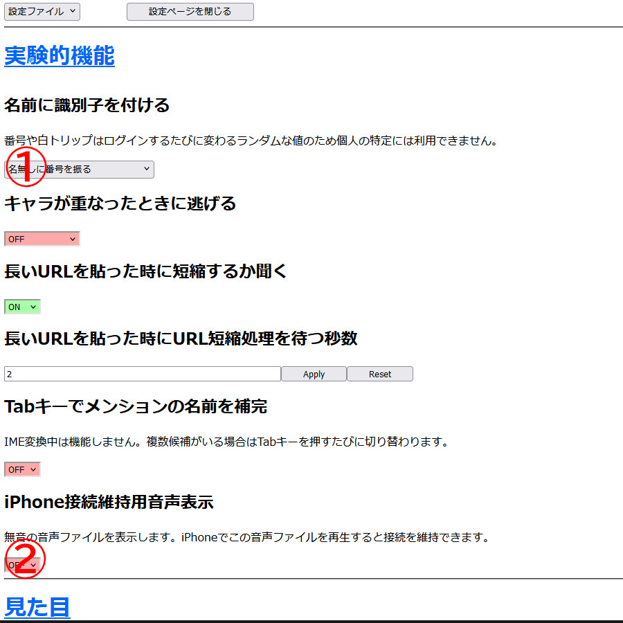
①配信者が「名無しさん123」などと呼ぶことがあるのはこの設定の番号です。区別がしやすくなるのでおすすめ。
②iPhone利用者はオン。
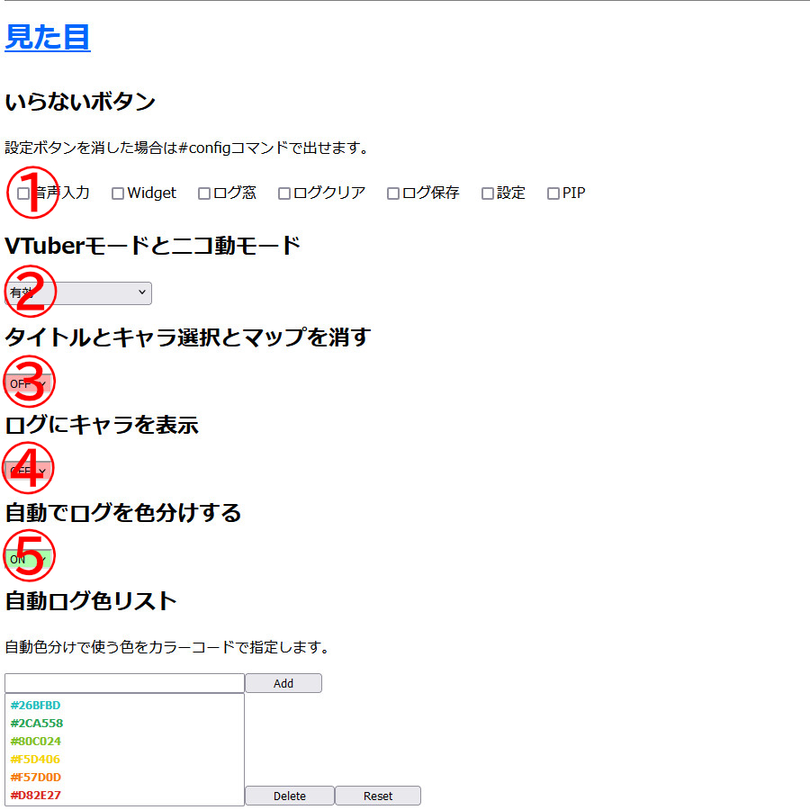
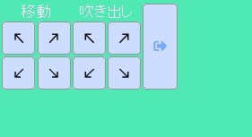
①一番下に並ぶ拡張用ボタンの表示/非表示です。
②使ってる配信者は少ないですが、配信時の声に合わせて動くキャラと流れるコメントの設定。
③表示を極限まで簡素化して、ログ画面しか見えなくなってしまうモードです。
④ログ1行1行にキャラ顔が付くモードです。ちょっと重くなるかもしれません。
⑤発言者ごとログの色分けをする設定です。※このページの↓に設定例があります。
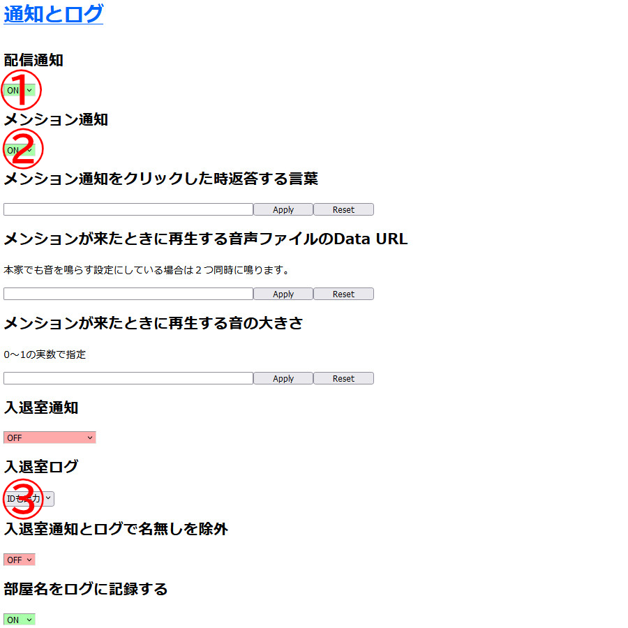
①入っている部屋で配信が始まるとバルーン通知が右下に出ます。
②自分の名前が打たれたときにバルーン通知を出す設定です。
③ログに人の入退室情報を追加する設定。
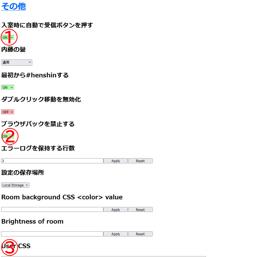
①受信ボタンを押さなくても最初から押される設定。
②ブラウザで戻るボタンを押しても別のページに戻らないようにする設定。
③CSSでデザインの変更を行う。※このページの↓に設定例があります。
デザイン設定の例
「自動ログ色リスト」の設定例
ライトモードとダークモードでそれぞれ色文字のコードの一例です。#ごとに(12回)貼り付けてください。
テーマ:ギコっぽい(ライト)
#D7452E
#E8701A
#E8C61A
#9DBF27
#1AAC50
#27B9A2
#2F92F2
#6B48C7
#9F518E
#777777
#444444
#000000
テーマ:ダーク
#D82E27
#F57D0D
#F5D406
#80C024
#2CA558
#26BFBD
#187BC5
#6B5CE0
#8B46C4
#C1408E
#EEEEEE
#888888
「User CSS」の設定例
長いですが#pageから水平線の上の}までコピーしてUser CSSの入力欄に貼り付けてください。
- ギコっぽい(ライト)用 先に歯車マークの設定ボタンからテーマを[ギコっぽい]に変えてください。
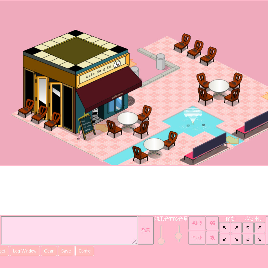
『桃』
|
+
|
開いてコピー |
#page-container.theme-gikopoi{
 background-color: #fbc;/*枠外背景*/
 color: #fff;/*配信者・ボタン上文字*/
 background-image: url("");/*背景画像*/
 scrollbar-color: #fcd #f8a;/*スクロールバー*/
}
.theme-gikopoi
.popup button {
 border: 1px solid #fff;/*ぽいぽい拡張ボタンのフチの色*/
 color: #fff;/*ぽいぽい拡張ボタン文字色*/
 background-color: #fbb;/*ぽいぽい拡張ボタン色*/
}
.theme-gikopoi .stream-buttons button.red-button {
background-color: #ffc;/*配信受信ボタン*/
}
.theme-gikopoi
.popup {
 color: #f88;/*ルーラウィンドウ文字色*/
 background-color: #fdd;/*ルーラウィンドウ背景色*/
}
.ui-widget-content .ui-state-default, html {
background: #fcc;/*効果音・TTS音量ツマミ*/
}
.ui-widget-content {
background: #fcc;
}
.ui-widget-header {
background: #fcc;
}
.theme-gikopoi #login-page button, .theme-gikopoi #toolbar button, .theme-gikopoi .stream-buttons button, .theme-gikopoi .slot-wrapper button .theme-gikopoi .popup button, .theme-gikopoi .stream-gain-control button {
 background-color: #fcd;/*ボタン色*/
 color: #f8a;/*ボタン文字色*/
}
.theme-gikopoi textarea {
 background-color: #fde;/*文字入力欄枠内色*/
 color: #f88;/*文字入力欄文字色*/
}
.theme-gikopoi .message {
 background-color: #fee;/*ログ枠内色*/
 border-color: #fff;/*ログ行色分け設定時サブ色*/
}
div[id^="vu-meter-bar-primary-"].inbound-vu-meter-bar {
background-color: #f88;/*配信音メーター色*/
}
div[id^="vu-meter-bar-secondary-"].inbound-vu-meter-bar {
background-color: #fcc;
}
div[id^="vu-meter-container"] {
background-color: #fff;
}
|
『空』
|
+
|
開いてコピー |
#page-container.theme-gikopoi{
background-color: #bcf;
color: #fff;
background-image: url("");
scrollbar-color: #fcd #8af;
}
.theme-gikopoi
.popup button {
border: 1px solid #fff;
color: #fff;
background-color: #bdf;
}
.theme-gikopoi .stream-buttons button.red-button {
background-color: #fcf;
}
.theme-gikopoi
.popup {
color: #88f;
background-color: #ddf;
}
.ui-widget-content .ui-state-default, html {
background: #bbe;
}
.ui-widget-content {
background: #bbe;
}
.ui-widget-header {
background: #bbe;
}
.theme-gikopoi #login-page button, .theme-gikopoi #toolbar button, .theme-gikopoi .stream-buttons button, .theme-gikopoi .slot-wrapper button .theme-gikopoi .popup button, .theme-gikopoi .stream-gain-control button {
background-color: #cdf;
color: #7af;
}
.theme-gikopoi textarea {
background-color: #def;
color: #88f;
}
.theme-gikopoi .message {
background-color: #eef;
border-color: #fff;
}
div[id^="vu-meter-bar-primary-"].inbound-vu-meter-bar {
background-color: #88f;
}
div[id^="vu-meter-bar-secondary-"].inbound-vu-meter-bar {
background-color: #ccf;
}
div[id^="vu-meter-container"] {
background-color: #fff;
}
|
- ダーク用 先に歯車マークの設定ボタンからテーマを[ダーク]に変えてください。
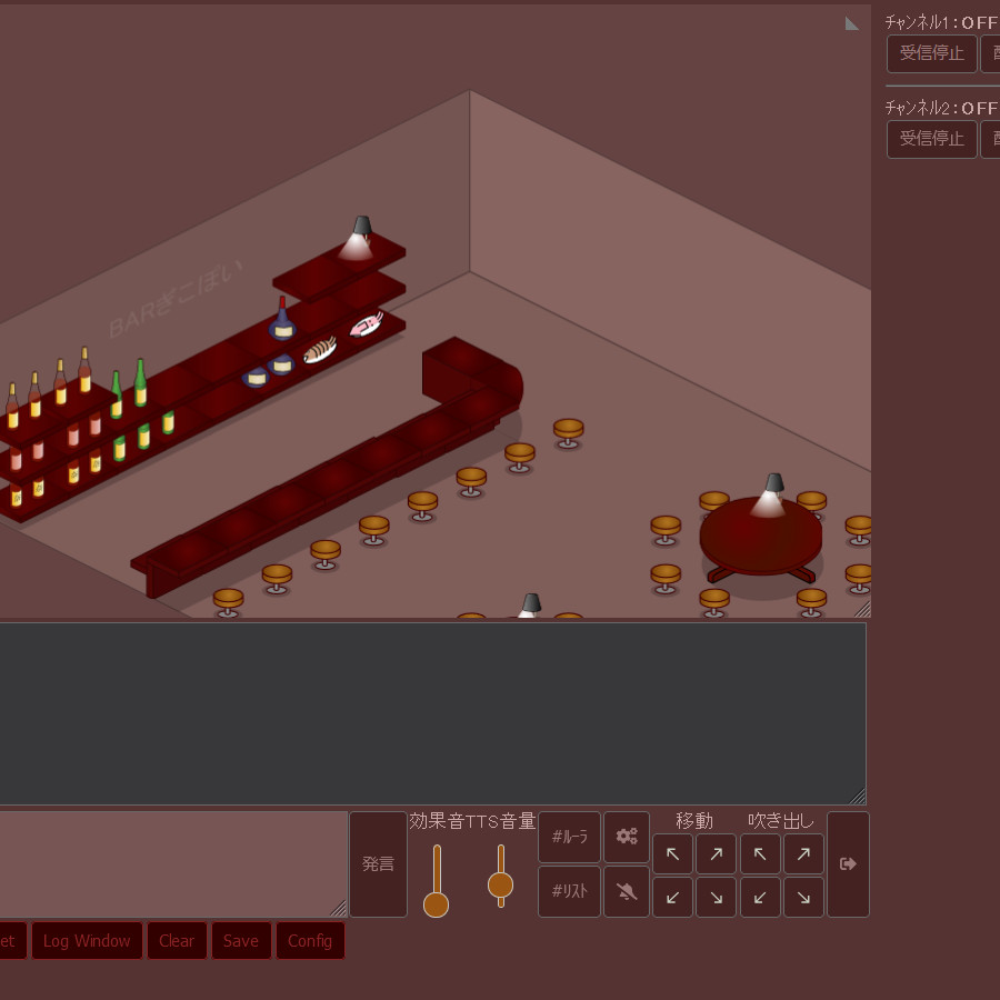
『バー』
|
+
|
開いてコピー |
#page-container.theme-dark{
 background-color: #533;/*枠外背景*/
 color: #caa;/*配信者・ボタン上文字*/
 background-image: url("");/*背景画像*/
 scrollbar-color: #86a #546;/*スクロールバー*/
}
.theme-dark
.popup button {
 border: 1px solid #822;/*ぽいぽい拡張ボタンのフチの色*/
 color: #822;/*ぽいぽい拡張ボタン文字色*/
 background-color: #300;/*ぽいぽい拡張ボタン色*/
}
.theme-dark .stream-buttons button.red-button {
background-color: #fec;/*配信受信ボタン*/
}
.theme-dark
.popup {
 color: #a88;/*ルーラウィンドウ文字色*/
 background-color: #333;/*ルーラウィンドウ背景色*/
}
.ui-widget-content .ui-state-default, html {
background: #951;/*効果音・TTS音量ツマミ*/
}
.ui-widget-content {
background: #951;
}
.ui-widget-header {
background: #951;
}
.theme-dark #login-page button, .theme-dark #toolbar button, .theme-dark .stream-buttons button, .theme-dark .slot-wrapper button .theme-dark .popup button, .theme-dark .stream-gain-control button {
 background-color: #422;/*ボタン色*/
 color: #977;/*ボタン文字色*/
}
.theme-dark textarea {
 background-color: #755;/*文字入力欄枠内色*/
 color: #ecf;/*文字入力欄文字色*/
}
.theme-dark .message {
 background-color: #333;/*ログ枠内色*/
 border-color: #000;/*ログ行色分け設定時サブ色*/
}
div[id^="vu-meter-bar-primary-"].inbound-vu-meter-bar {
background-color: #fec;/*配信音メーター色*/
}
div[id^="vu-meter-bar-secondary-"].inbound-vu-meter-bar {
background-color: #cb9;
}
div[id^="vu-meter-container"] {
background-color: #000;
}
|
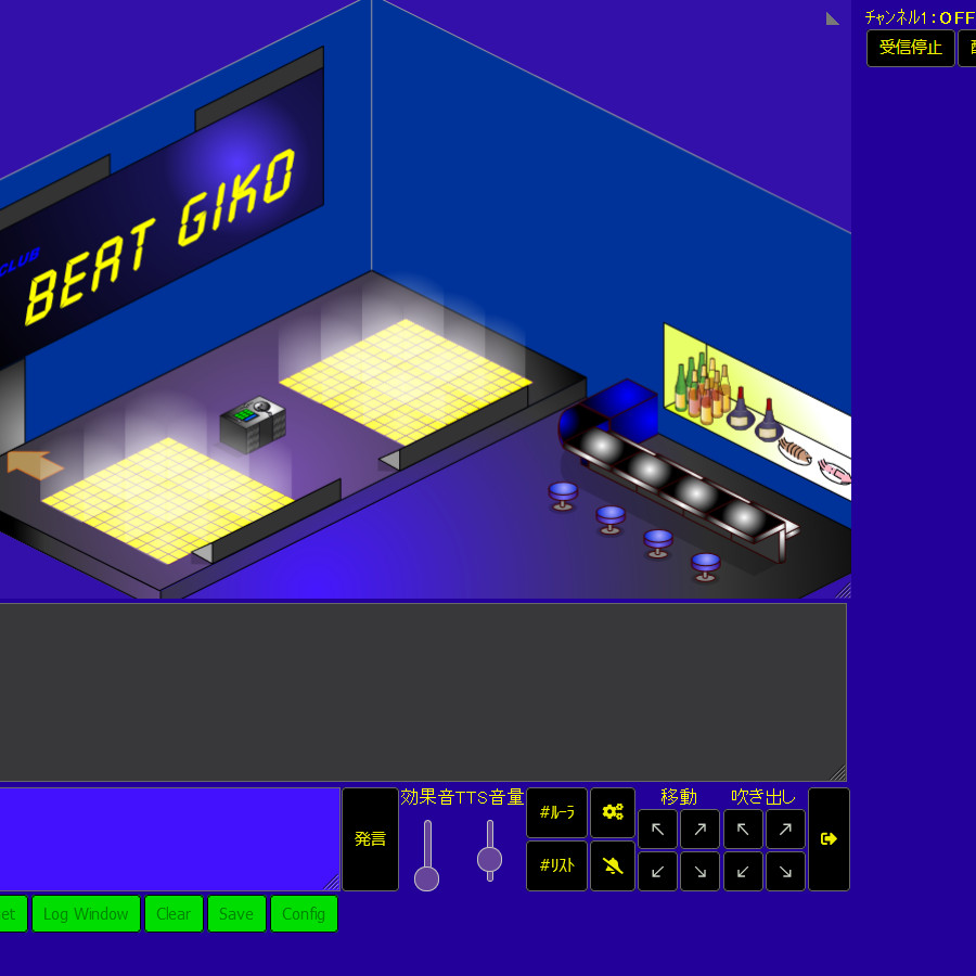
『BEAT GIKO』
|
+
|
開いてコピー |
#page-container.theme-dark{
 background-color: #209;
 color: #ff0;
 background-image: url("");
 scrollbar-color: #ff0 #41f;
}
.theme-dark
.popup button {
 border: 1px solid #000;
 color: #080;
 background-color: #0d0;
}
.theme-dark .stream-buttons button.red-button {
background-color: #ff0;
}
.theme-dark
.popup {
 color: #ff0;
 background-color: #333;
}
.ui-widget-content .ui-state-default, html {
background: #649;
}
.ui-widget-content {
background: #649;
}
.ui-widget-header {
background: #649;
}
.theme-dark #login-page button, .theme-dark #toolbar button, .theme-dark .stream-buttons button, .theme-dark .slot-wrapper button .theme-dark .popup button, .theme-dark .stream-gain-control button {
 background-color: #000;
 color: #ee0;
}
.theme-dark textarea {
 background-color: #41f;
 color: #ff0;
}
.theme-dark .message {
 background-color: #333;
 border-color: #000;
}
div[id^="vu-meter-bar-primary-"].inbound-vu-meter-bar {
background-color: #ff0;
}
div[id^="vu-meter-bar-secondary-"].inbound-vu-meter-bar {
background-color: #aa0;
}
div[id^="vu-meter-container"] {
background-color: #000;
}
|
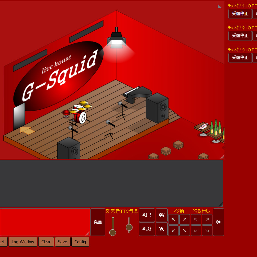
『G-Squid』
|
+
|
開いてコピー |
#page-container.theme-dark{
 background-color: #900;
 color: #fc0;
 background-image: url("");
 scrollbar-color: #900 #600;
}
.theme-dark
.popup button {
 color: #000;
 background-color: #a64;
}
.theme-dark .stream-buttons button.red-button {
background-color: #ff0;
}
.theme-dark
.popup {
 color: #f00;
 background-color: #333;
}
.ui-widget-content .ui-state-default, html {
background: #642;
}
.ui-widget-content {
background: #642;
}
.ui-widget-header {
background: #642;
}
.theme-dark #login-page button, .theme-dark #toolbar button, .theme-dark .stream-buttons button, .theme-dark .slot-wrapper button .theme-dark .popup button, .theme-dark .stream-gain-control button {
 background-color: #600;
 color: #fff;
}
.theme-dark textarea {
 background-color: #d00;
 color: #fff;
}
.theme-dark .message {
 background-color: #333;
 border-color: #000;
}
div[id^="vu-meter-bar-primary-"].inbound-vu-meter-bar {
background-color: #fff;
}
div[id^="vu-meter-bar-secondary-"].inbound-vu-meter-bar {
background-color: #f88;
}
div[id^="vu-meter-container"] {
background-color: #000;
}
|
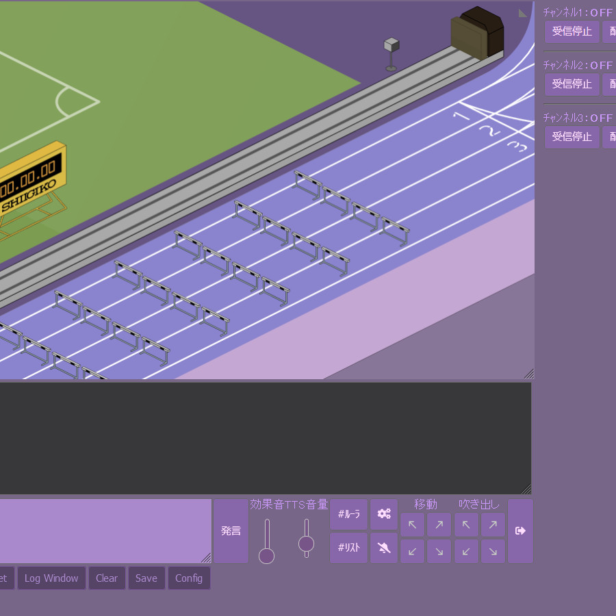
『葡萄』
|
+
|
開いてコピー |
#page-container.theme-dark{
 background-color: #768;
 color: #c9f;
 background-image: url("");
 scrollbar-color: #86a #546;
}
.theme-dark
.popup button {
 border: 1px solid #759;
 color: #a8c;
 background-color: #546;
}
.theme-dark .stream-buttons button.red-button {
background-color: #9af;
}
.theme-dark
.popup {
 color: #a8c;
 background-color: #333;
}
.ui-widget-content .ui-state-default, html {
background: #758;
}
.ui-widget-content {
background: #758;
}
.ui-widget-header {
background: #758;
}
.theme-dark #login-page button, .theme-dark #toolbar button, .theme-dark .stream-buttons button, .theme-dark .slot-wrapper button .theme-dark .popup button, .theme-dark .stream-gain-control button {
 background-color: #86a;
 color: #fdf;
}
.theme-dark textarea {
 background-color: #a8c;
 color: #ecf;
}
.theme-dark .message {
 background-color: #333;
 border-color: #000;
}
div[id^="vu-meter-bar-primary-"].inbound-vu-meter-bar {
background-color: #a8c;
}
div[id^="vu-meter-bar-secondary-"].inbound-vu-meter-bar {
background-color: #86a;
}
div[id^="vu-meter-container"] {
background-color: #000;
}
|
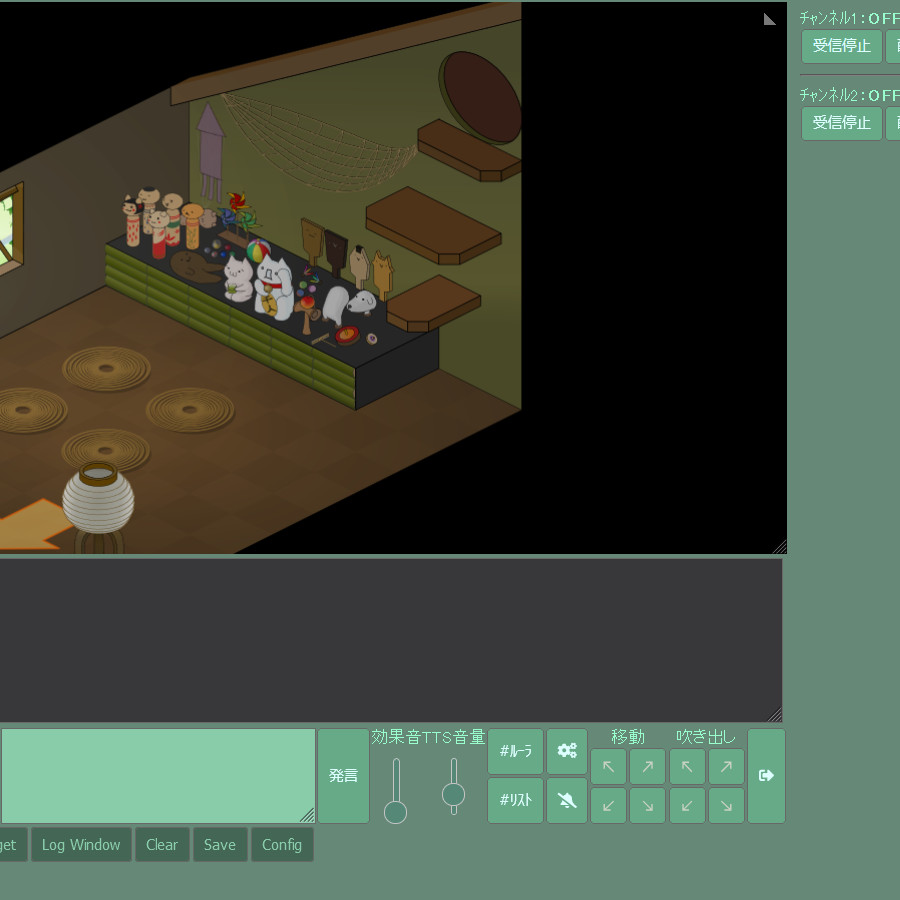
『黴』
|
+
|
開いてコピー |
#page-container.theme-dark{
 background-color: #687;
 color: #9fc;
 background-image: url("");
 scrollbar-color: #6a8 #465;
}
.theme-dark
.popup button {
 color: #8ca;
 background-color: #465;
}
.theme-dark .stream-buttons button.red-button {
background-color: #af9;
}
.theme-dark
.popup {
 color: #8ca;
 background-color: #333;
}
.ui-widget-content .ui-state-default, html {
background: #587;
}
.ui-widget-content {
background: #587;
}
.ui-widget-header {
background: #587;
}
.theme-dark #login-page button, .theme-dark #toolbar button, .theme-dark .stream-buttons button, .theme-dark .slot-wrapper button .theme-dark .popup button, .theme-dark .stream-gain-control button {
 background-color: #6a8;
 color: #dff;
}
.theme-dark textarea {
 background-color: #8ca;
 color: #cfe;
}
.theme-dark .message {
 background-color: #333;
 border-color: #000;
}
div[id^="vu-meter-bar-primary-"].inbound-vu-meter-bar {
background-color: #8ca;
}
div[id^="vu-meter-bar-secondary-"].inbound-vu-meter-bar {
background-color: #6a8;
}
div[id^="vu-meter-container"] {
background-color: #000;
}
|
自分でカスタマイズする
ぽいぽい拡張の設定項目一番下のShow color pickerをonにするとこのようなボタンが出ます。
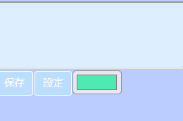
これを押すと色作成のパレットが出るので、左の基本色を参考に好きな色を作り
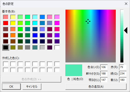
右下の数字、赤・緑・青を下記のように入力します。
画像の緑色の例:rgb(79,234,180)
これをCSSの例として載せたコードの、色指定部分「#bcf」などの部分に上書きで貼り付けます。
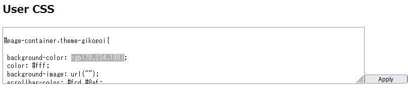
右のApplyボタンを押すと適用されます。
オリジナルの良い設定が出来上がったらコメントかスクショページで投稿してみてください。
詳しい方でしたらもっと独創性のあるデザインにできると思います。
ぽいぽい拡張ページのコメント
10行ずつに分けて投稿してください。


